24 hour fitness - redesign
Client: Design Exercise (Individual project)
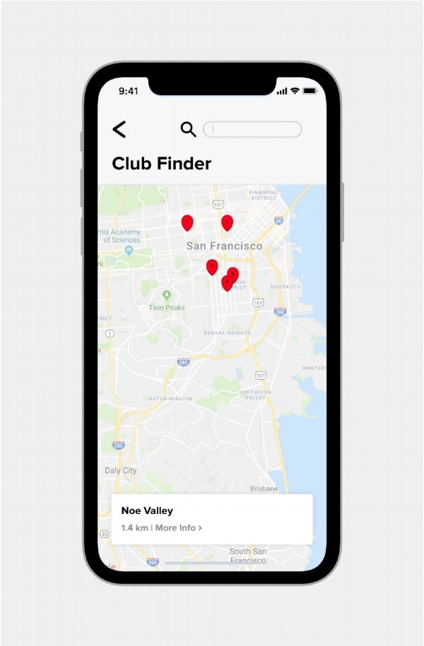
Although 24 Hour fitness is one of the most popular gym's in San Francisco, its iOS App is barely satisfactory. I hate using their app every time I have to go to the gym. It is very confusing and visually unappealing. The aim was to give it an uncluttered style while keeping the brand color (red) and also give it a more modern and professional appearance.
This app provides a platform for the user to be able to keep a track of their workout and also not waste time while trying to figure out how to use it.
My survey showed that 90% of the people (24 hour gym members) were faster in using the app and achieving results in comparison to the old app.


